Book Notes: Cover Story August 5, 2025 / Ari Magnusson
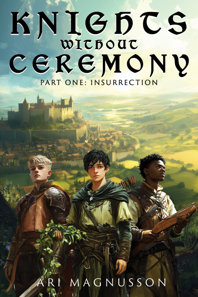
The cover for my new book, Knights Without Ceremony: Insurrection, is not typical for upper middle grade medieval adventures—and for a very good reason. In the summer of 2024, I engaged ten middle school boys from my town of Winchester, Massachusetts, to provide feedback on an early draft of the book. But I also asked them about covers. I was very interested in knowing what readers in my target audience—upper middle grade boys—thought about the covers of current books in that category. I had seen the news in Publishers Weekly about the declining sales in middle grade books and the migration of these readers to graphic novels. I had a suspicion about what might have been harming sales, and I wanted to see if I was right.
One task I assigned to the feedback team was to tell me what book covers they liked and didn’t like. I had them look at books in Book Ends, my wonderful local independent bookstore, and also sent them a selection of cover images from the leading books in the category. Without exception, my feedback team told me that the covers of books marketed for middle grade readers were often insulting and belittling, especially those that showed characters and backgrounds that looked like simple cartoons. They felt the books were for little kids, not them. The books were extremely off-putting. The members of the feedback team said they actually liked the covers of books geared toward young adults. They liked covers showing older kids, not little kids, and liked details in the art that provided an air of mystery. They also liked cover elements that were clues to what the story contained—elements that invited investigation. This was exactly what I had suspected.
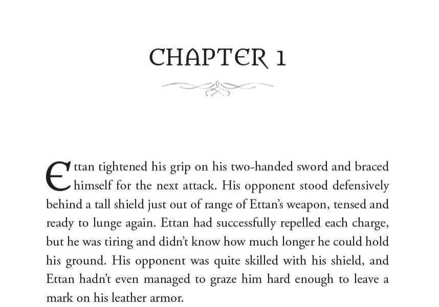
In designing the cover of the book, I decided to pose the three main characters on the front, with some details that would be explained in the book (the main character holding… a plant?!?). I wanted to have an open, expansive scene that was inviting to the reader and would be explained in the first chapter. On the back cover, I wanted an element that is a key theme of the story. And I wanted all of it to be rendered in an art style that would make the book appear to be for young adults.
The process for the cover creation was made easy by the great team that did it. I provided a rough design to the artist, Reece-Alexander Norris-Paterson, who lives in the UK. He created the wonderful art that forms the entire cover and also drafted the cover text. I then had my book’s interior designer, Liz Schreiter, make adjustments to the draft cover text and fonts to get the spine details to fit and to better adjust the subtitle and author name. She also placed the publishing logos on the back and spine, added the UPC, and fit the covers into the required publishing templates.

Subscribe
To subscribe to the posts, please enter your email address.


